I trust the results from this section of my survey slightly less than other sections. I’m often pretty skeptical of accusations of selection bias, which I think are applied with a crude and performative hand by people who don’t actually understand when and why selection bias is bad, but here feels like actually the correct place to be more cautious. My guess is that people who took this survey have selection pressure across a couple axes, something like “reads English” and “is not morally offended by doing a fetish survey” and “is connected to western networks.” I’d predict that differences we find here between countries are less extreme than actually exist due to this. We’re probably surveying the youngest, most western, most-online people from each region, who are more likely to be similar to each other.
Knowingless is a reader-supported publication. To receive new posts and support my work, consider becoming a free or paid subscriber.
Again, for reference - who took my survey - this post is working off my latest dataset of 437,000 people. I’m not claiming this is representative of the world population by any means! I encourage you to familiarize yourself with the population I’m surveying.
Knowingless is a reader-supported publication. To receive new posts and support my work, consider becoming a free or paid subscriber.
I only included regions with a minimum of 10,000 responses. Some of the individual section of the survey had fewer responses, because they were conditional on previous questions.
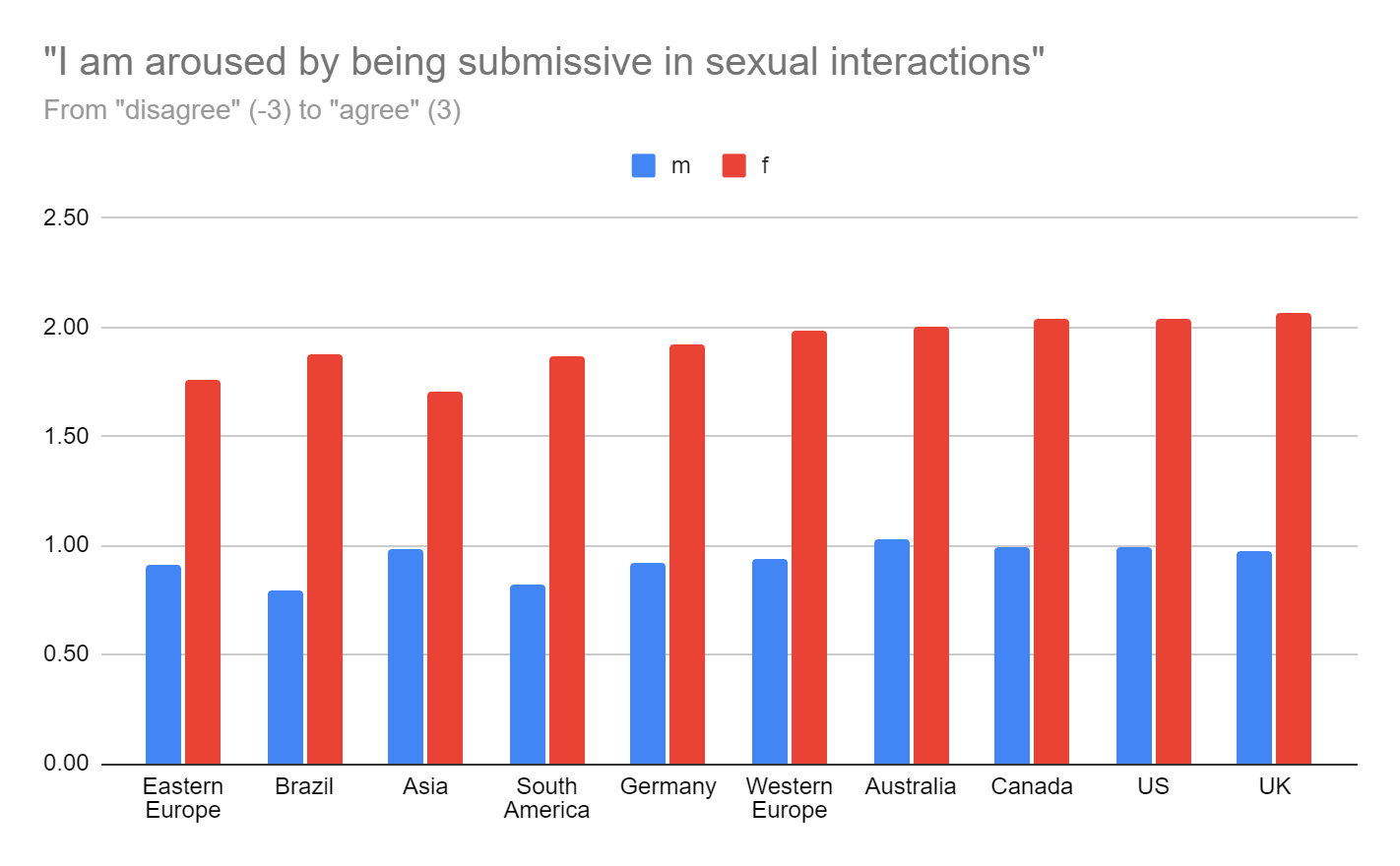
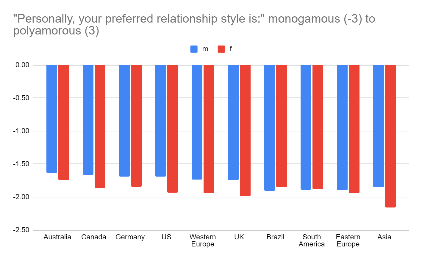
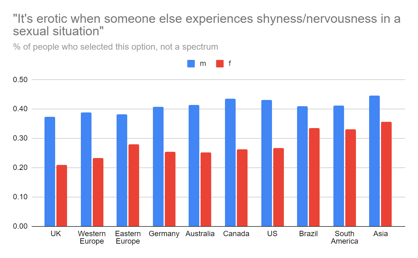
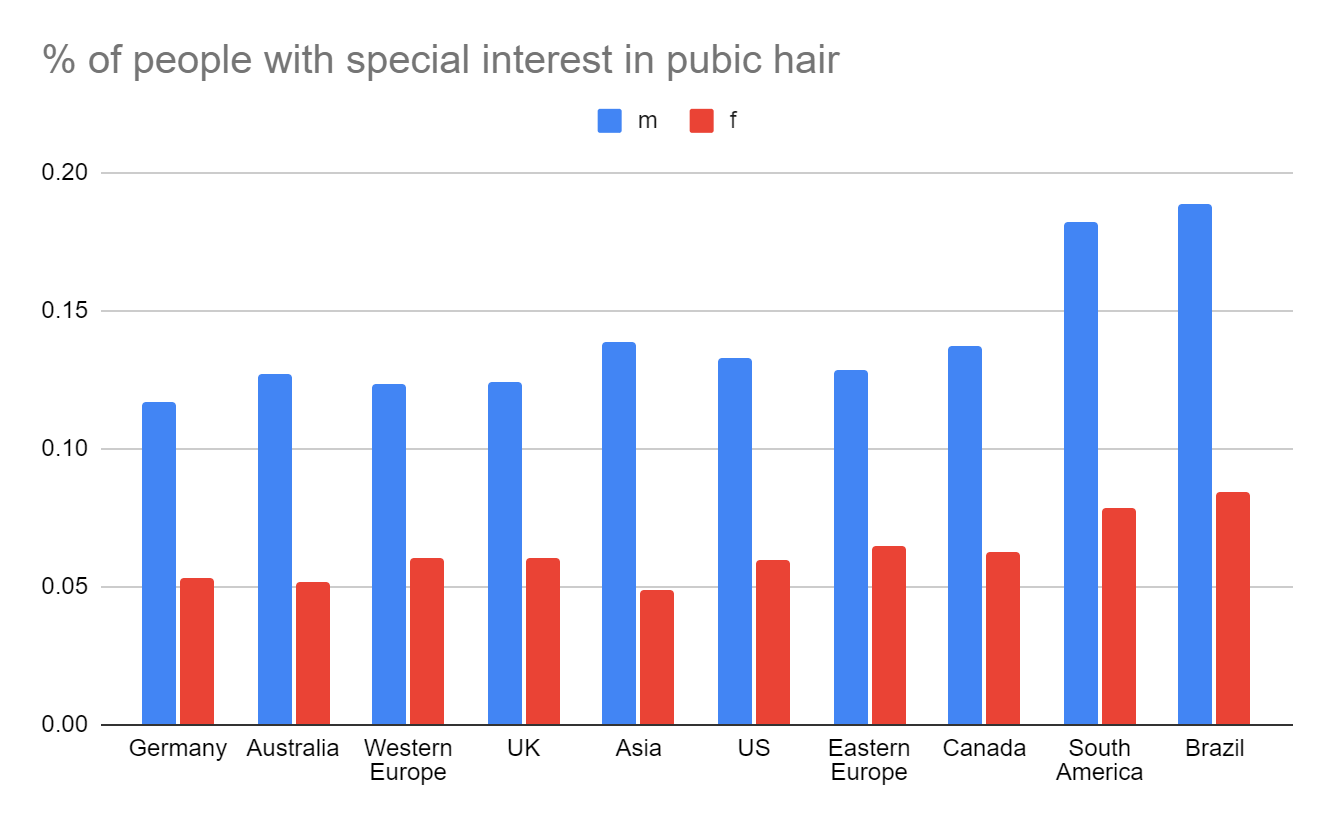
This post is just gonna be a spam of a ton of graphs, without much analysis. I’m going to include graphs I find interesting, and ones that seem to have higher difference than most. I’m not including graphs that don’t have significant difference; if a question is not included, please assume I didn’t find any differences. I would include all of them, but that would be around a thousand graphs and I am just not going to do that.
Some of the regions are subcategories of the others - for example, Germany itself had over 10k responses, but I also included its responses in the overarching “Western Europe” group. In hindsight I wish I’d just merged “Brazil” and “South America” into a single category for the graphs for the sake of simplicity, but I already went and made them all and I don’t want to redo it.
All numbers, unless otherwise specified, are simple averages.
The m/f divide in this data is by biological sex, not by gender. This isn’t an ideal option, but I’m going with it so far because in my data biological sex seems to predict sexual preferences more accurately than gender.
Also warning:check the y axis. I fixed the y axis on some, but intentionally didn’t on some others where it felt like the information was better presented when zoomed in. This was at my whim; please make sure you pay attention to the axis yourself. I include what the full range was in nearly all of them.
You can look at the raw data here. Unfortunately it’s a bit hard to interpret right now; I haven’t gotten around to manually including descriptions and in-survey scales of all the questions yet.
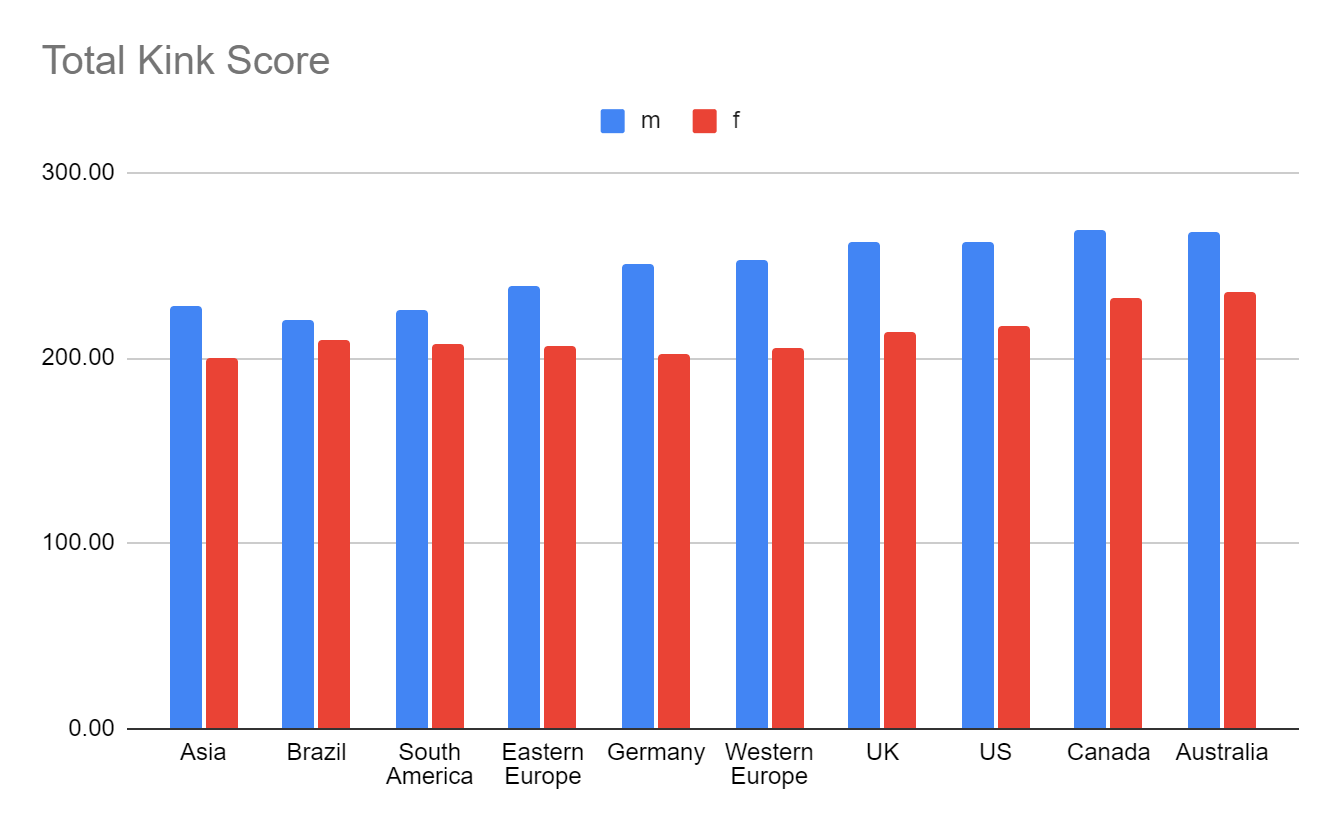
This isn’t a “scientific” score. Data comes from my kink survey, where I measured kinkiness based on ratings from *another* survey, where I had people rate how taboo various kinks were. I then ran all this through some algorithms that assigned each user a score based on the tabooness of the kinks they selected, modified by the degree to which they were into them, as well as a bit by gender and orientation. The goal was giving a good score, but I put quite a lot of thought into it and the score should roughly correlate with how actually kinky people are.
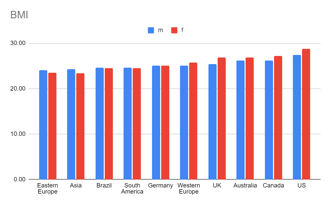
Calibrating reliability with a score we actually know the data for - BMI
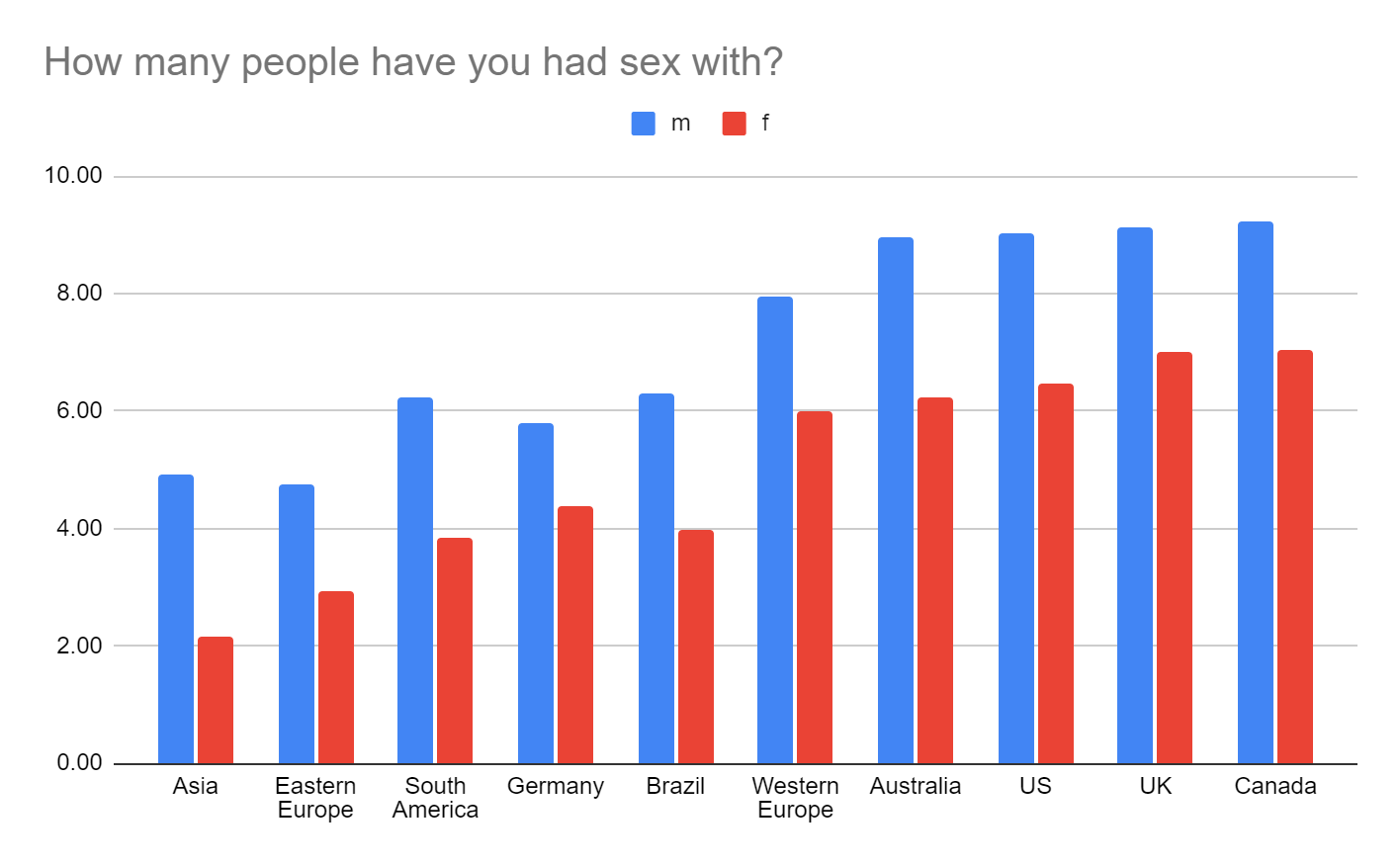
according to ancient tradition, we see men reporting greater sex partners than women, despite both groups necessarily having the same amount of sexual partners on average (assuming straight sex)
I’m not controlling the other numbers for age, but worth throwing this in for context to check if any of the other graphs might be age-confounded.
I gave people a list of 19 mental illnesses and asked them to check any that applied. This graph is the average of the total amount people selected.
The exact question text was “How "sexually liberated" was your upbringing? Highly repressed" might be a highly conservative religious community where ankles must be covered, and "Highly liberated" might be a community where free love, nudity, or sexual expression was encouraged.”
Interesting how females rate their childhood homes as messier than males! Evidence of higher cleaning standards?
Powerlessness Variable is how much people agreed with three statements - "If life is a game, then I'm losing", "I don't have very much power over those around me", and “I deserve more respect than I get”. This isn’t a validated scale or anything, I selected them as an attempt to get at a sense of powerlessness. People responded on a -3 (strong disagree) to 3 (strong agree) scale for each of the 3 questions. The graph above represents the added score for all three.
People were asked to rate how erotic sexual eagerness (such as begging, worshipping, teasing, etc.) was, on a 0-5 scale.
I used two scales in my survey, a disagree-neutral-agree scale, and a nothot-yeshot scale. In hindsight I used inappropriate scales for some of them; this is an example. Still useful info though!
This question was only given to people who answered “yes” to the question “Have you had an officially administered IQ test?”. My guess is that the strong skew to higher scores is that gifted kids are disproportionately given IQ tests, and that people are more likely to report their IQ at all if they scored higher. I wouldn’t put a ton of stock in the results from this question.
I asked about age of onset (“when did you first start experiencing interest in this fetish?”) for a lot of fetishes, but I’m including this one because it has an unusually high variance in scores across location. Not sure what to make of it!
Also a high distribution. I wish I’d asked about childhood pets!
I asked about 3 different degrees of bondage - light, medium, and extreme. This is the average of people’s answers to those three questions.
The description I used in the survey was “Economic leftists tend to prefer higher government involvement in the economy, for example more welfare or wage regulations. Economic rightists tend to prefer lower government involvement in the economy, for example free markets and low taxes”
The description I used in the survey was “Social leftists tend to prefer lower government involvement in social issues, for example allowing drugs and abortions. Social rightists tend to prefer higher government involvement in social issues, for example outlawing sex work or obscenities.”
The description I used in the survey for this question was “Was it on you (buck up, pull yourself up by bootstraps, individualism, grin and bear it) or was it on the world (fight for a change, ask for help, sympathy for suffering, demand what you're owed)?”
To help you calibrate, 5 is equivalent to “a few times a month”, 6 is “once a week”, 7 is “multiple times a week”, and 8 is “daily”
Only asked of people who marked “yes” to a question asking if they’d been at least semiregularly abused in childhood
Beware noisier sample sizes here; the smallest bin, Asia, included only 81 males and 58 females.
I find this one interesting because the question specified ‘compared to other people in your country’. My guess is this is capturing a bit of “how fortunate do you think you have it” in addition to the actual class measured. Also interesting is the very slight difference between male and female!
in-survey description: “As in; do you require a very specific set of circumstances to feel aroused, or is a wide variety of things arousing to you?”
For calibration, 1 is “a little bit,” and 2 is “a moderate amount”
The anxiety/depression self report rates here are… kind of insane? I doublechecked the data but this appears to be correct. Many of my respondents are young and from tiktok, maybe this explains some of it. Even still!
survey description was a broad category including stuff like sissification, futa, crossdressing, etc.
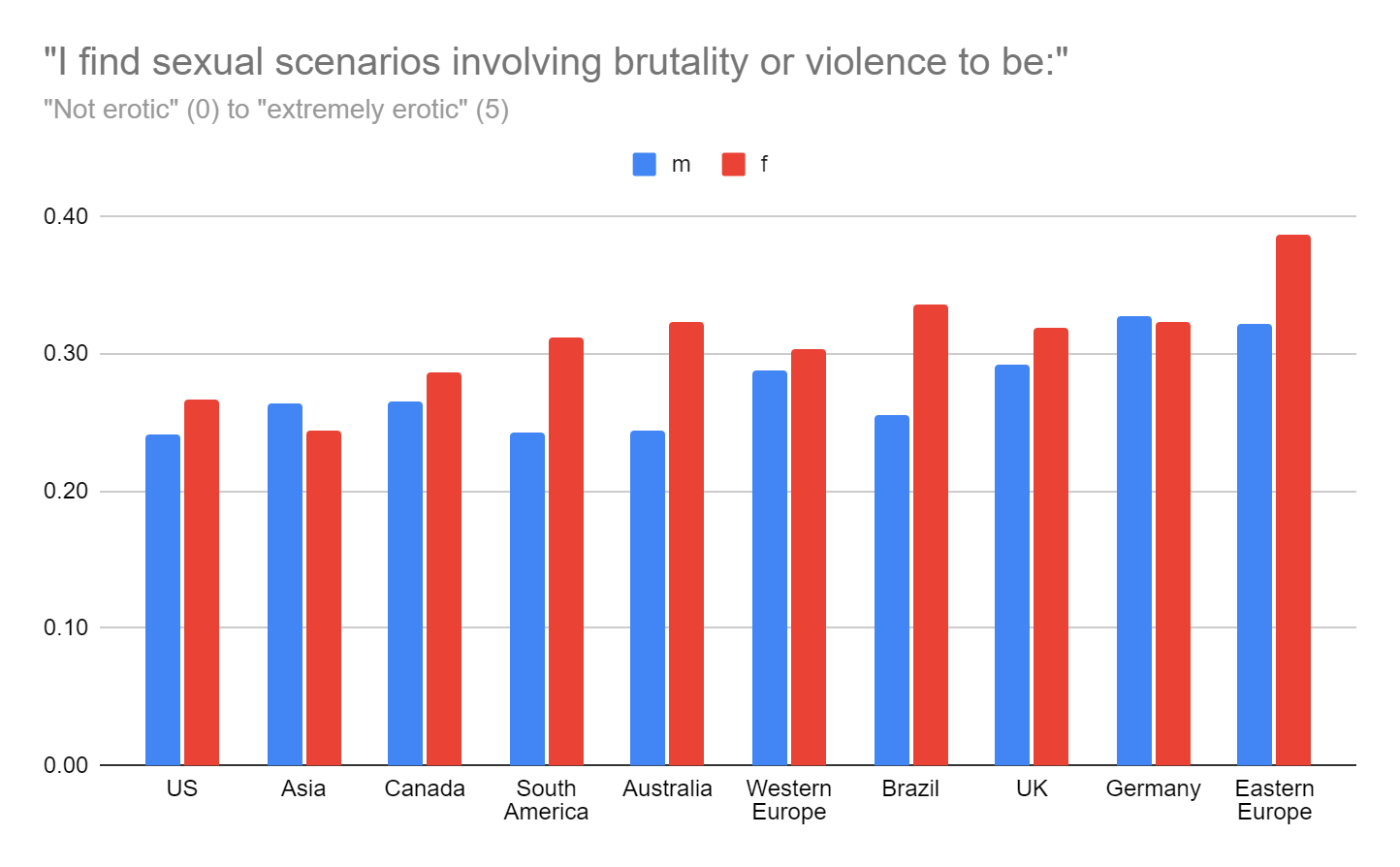
Interesting that Eastern Europe scores lowest on humiliation but highest on brutality!
This feels like maybe evidence for beauty standards in fact hitting females harder than males
Again, remember absolute sample sizes here got pretty low
This one is really interesting to me. Corsets are pretty romance-coded, and I suspect females are answering while imagining themselves wearing the corset, and males imagining females wearing the corset.
Compare this to thongs:
If you got this far, I’m impressed. I wasn’t super thorough when selecting these graphs, mostly sorted by standard deviation and squinted a bunch. Make sure to check the raw data linked at the beginning if you want to comb more carefully!
Knowingless is a reader-supported publication. To receive new posts and support my work, consider becoming a free or paid subscriber.
The only thing I want to say is I wish instead of each graph being labeled from lowest to highest, that the countries stayed in one spot each graph so I could more easily compare visually how each country is doing graph to graph.
Much easier to know “UK” is spot 3 and look there right away then to look for it in each individual graph













The only thing I want to say is I wish instead of each graph being labeled from lowest to highest, that the countries stayed in one spot each graph so I could more easily compare visually how each country is doing graph to graph.
Much easier to know “UK” is spot 3 and look there right away then to look for it in each individual graph
Love your work
This really was such a fantastic read. It was so interesting to find connections between certain topics, and especially between genders.