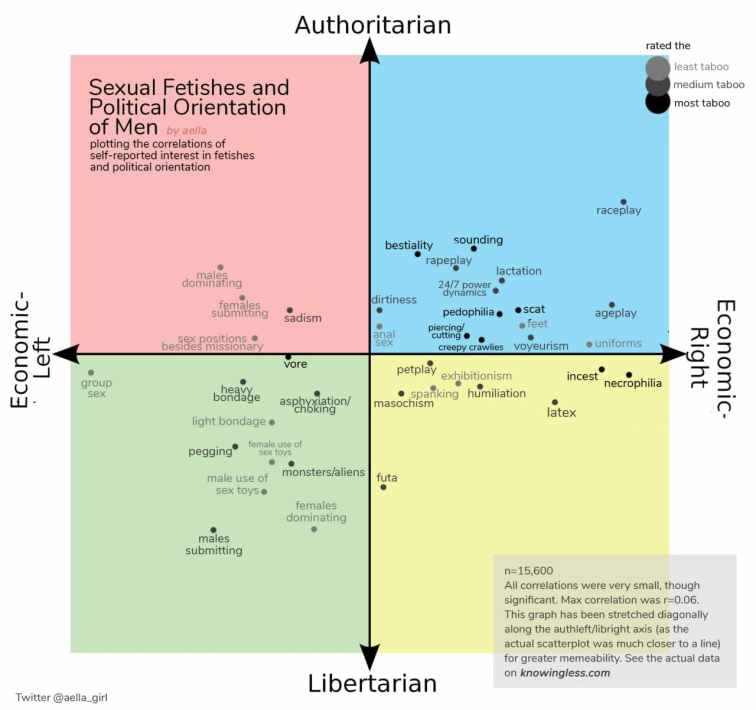
I asked a bunch of people (~19k) what kinks they were into, and as an almost-afterthought asked people what quadrant of the political compass they were on.
Almost all the political-fetish correlations were uninterestingly weak, but the sample size was huge enough that it became very unlikely that the correlations were showing up due to chance. So, for fun, I put them on a political compass chart.

The charts were done by adding authleft and authright answers (to get auth answers), libright and authright (to get right answers), etc. and then checking fetish correlations with these (as I now had auth, lib, right, left). I then combined the auth-lib correlations and the right-left correlations via subtraction into one point, and then plotted those points.
The fetishes are shaded from grey to black, with darker equivalent to more taboo. You can find the original findings from my taboo survey here.
You’ll notice in the above graphs, there’s a distinct diagonal skew. I tried to “undo” the skew a bit so that things were more equally spread out for the purposes of joyful memeage, however the actual data was way more clustered around the trendline.
The cluster around the trendline is interesting and really confusing, for me. It looks like there’s something politically that’s predictive of fetish, but that something is mostly a left-right spectrum with a little bit of lib-auth skew? Why would this be? I don’t know how to think about this and am very curious for theories.
Also, not included in the memegraphs cause it would require too much explanation – the “Score” is also listed as a point, which corresponds to the total tabooness of the fetishes for the person answering (a simple adding a tabooness score for each fetish they marked being into, with higher scores for being more into it). For the male graph the highest taboo score exists in libright, and for females it’s near the border in authleft).
Both men and women were more likely to be gay if they identified as libertarian-left ((r=0.1 and r=0.21, respectively).
Surprisingly, I found basically no correlation with age and location on the graph (except for maybe liblefts being younger if you squint). This makes me feel slightly unsettled, as I had a lot of weight on “political orientation is stratified by age.”
But in general, the political compass isn’t a great graph; I asked people to self-identify, and didn’t place them based on diagnostic questions. I suspect people overreport being libertarian, because libertarian is a nicer word than authoritarian.


