Our Collective Synesthesia, In Graphs
the most common colors for numbers, months, and weeks
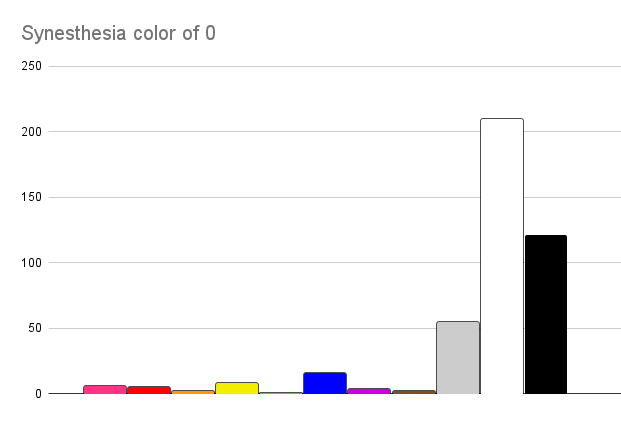
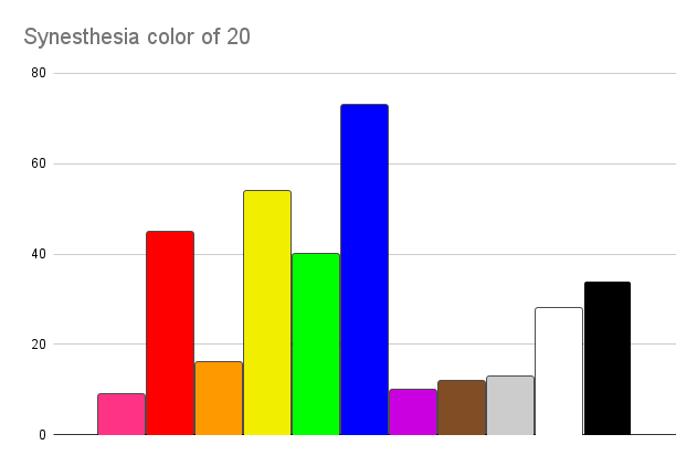
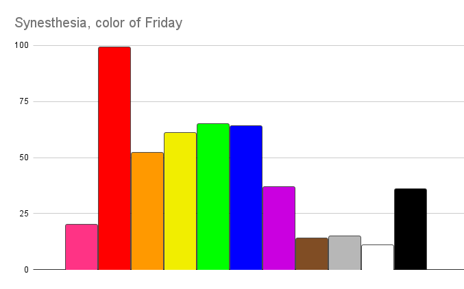
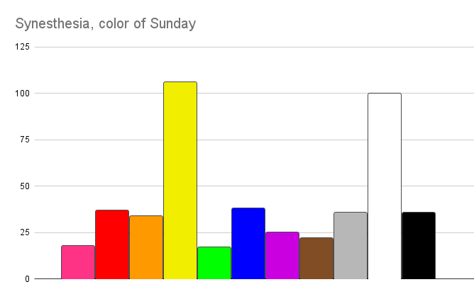
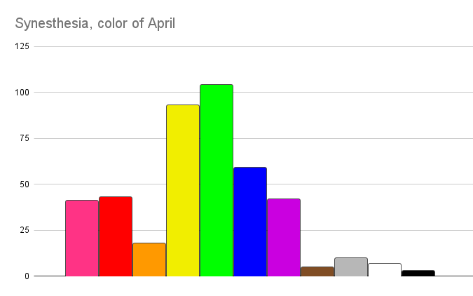
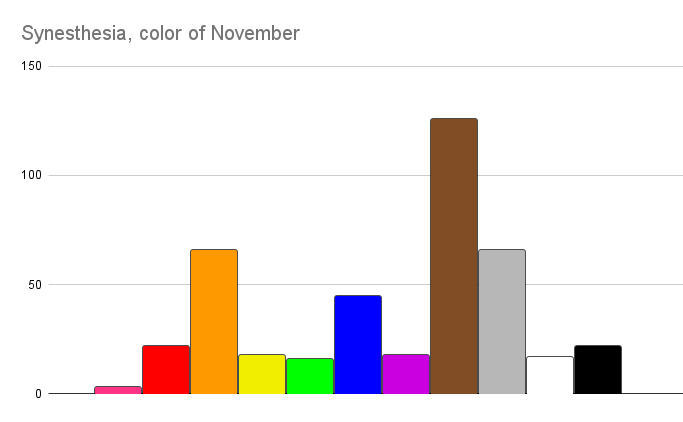
I asked around 450 people with synesthesia what color numbers, days, and months were. Here’s the average results!
The bars are the colors themselves, and the height is the number of people who reported that color was the correct color to describe the number/day/month.
Not sure if I should hurr durr some methodology description here, this feels like the preschool version of data, but if you want to look at the survey itself (or take it before you’re primed by looking at the results!) you can do so here.
I used python to look at the data, and I’m new to python but it was pretty simple? The raw data is here if you wanna look at it yourself or check my work.
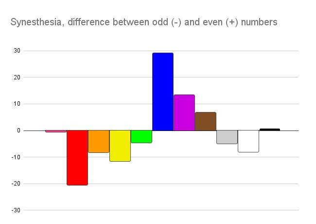
But before I slam a few dozen raw graphs into your vision, I did get curious about the difference between odd and even numbers. This graph below is me grouping all the even and odd numbers separately, averaging the amount of times people said the numbers in that group were each color, and then plotting the difference.
Basically, the lower bar on the chart, the more people put that color on odd numbers; the higher, the more people put it on even numbers.
I asked about numbers 0-20, curious if numbers like 13 corresponded more to ‘1’ or ‘3’, or if they were their own thing itself. It looks like generally there’s really tight correspondence to the individual numbers - 13 looks like the chart for 3, and 14 for 4, and so on.
Days of the week
Months
This might be my favorite set; you can see the colors of the month generally rotate through the colors of the seasons, and a clear holiday influence in October, December, and February.
General reminder, if you’d like to take any of my surveys, my ongoing open ones are listed here












I like the graphs! Nice and clean. What library did you use for visualization?